
Free Responsive Website Tester
Check your site on every screen, all at once
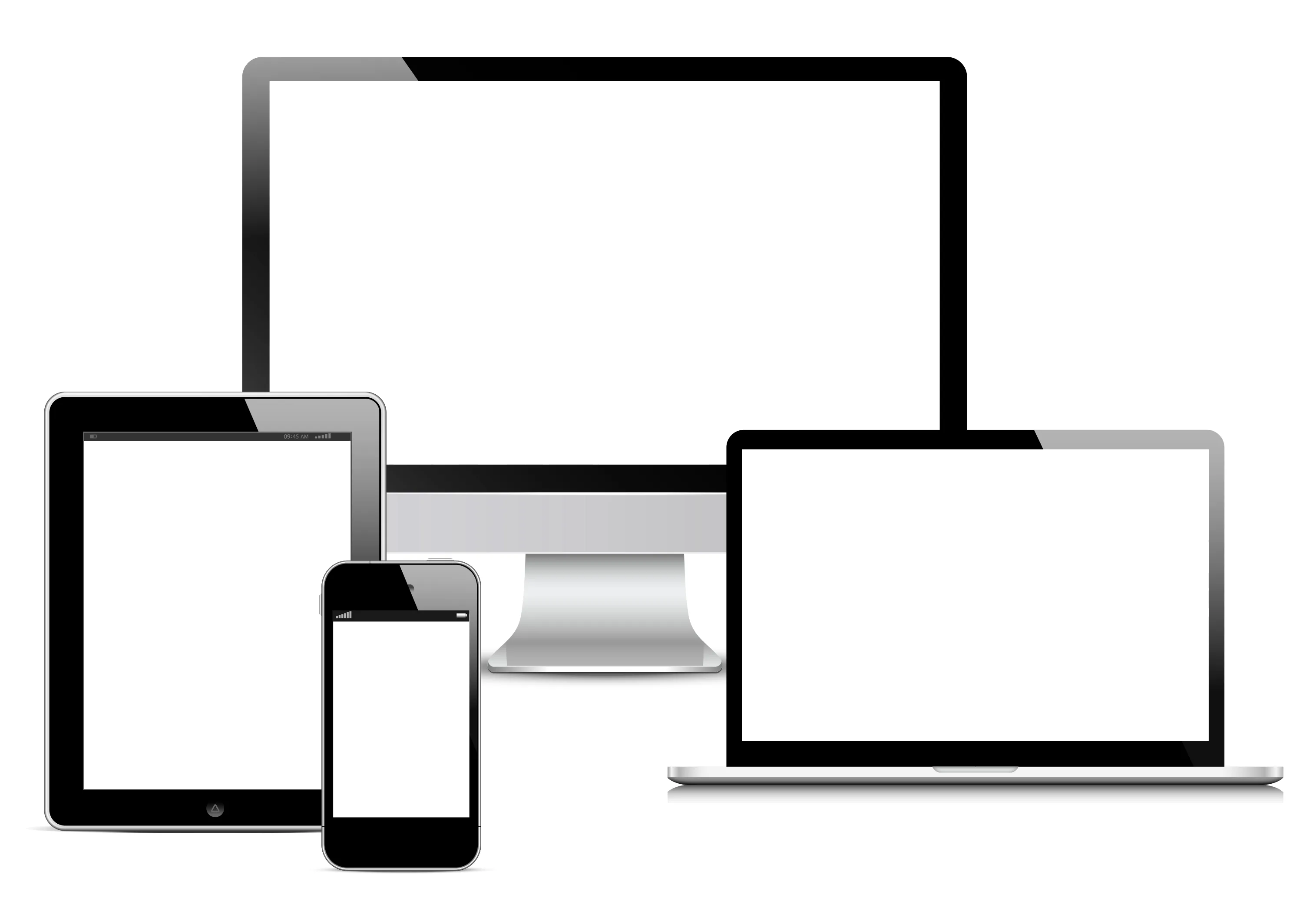
Paste any URL to preview it live in real browsers across desktop, laptop, tablet, and mobile — simultaneously. Choose from 60+ real device presets, sync-scroll every frame, and export a single branded screenshot as PNG, JPG, WebP, PDF, or SVG. Free, no signup.
What you get
A complete responsive design toolkit
Instant, no signup
Open the tool, paste a URL, and see a live multi-device preview immediately. No account, no install, no credit card.
Real browser rendering
Every frame is a real browser viewport served through our proxy, so CSS, JavaScript, and fonts render exactly as they would on the actual device.
Five export formats
One click captures all four device frames as a single image — PNG with a transparent-background option, JPG, WebP, SVG, or even a shareable PDF.
60+ device presets
From the iPhone 16 Pro to 8K displays, ultrawide monitors, and foldables — with a searchable picker grouped by desktop, laptop, tablet, and mobile.
Synced scrolling
Scroll one frame and every device follows proportionally, with an interactive scrollbar per frame that feels like the real thing.
Shareable links
Send a link with ?url= to teammates or clients — they land on the exact same preview instantly.